

Best Crystal Velvet Printed Carpet Styles to Elevate Your Home Decor
2026-08-26
Crystal velvet printed carpets are the quiet upgrade most living rooms are missing. Unlike flat, forgettable rugs, these pieces catch light in a way that makes patterns feel richer and colors more saturated, so even a simple layout gains instant depth. But with dozens of styles floating around, it's easy to pick something that looks stunning online and flat at home. That's where a little guidance helps. Below, we've rounded up the standout looks worth considering, with practical pairing ideas from Senseco to keep your space feeling curated rather than cluttered.
The way velvet pile softens even the boldest carpet prints
Bold carpet prints often carry sharp, saturated geometry or oversized florals that can feel aggressive when rendered on flat, low-pile surfaces. Velvet changes that equation. The dense, upright fibers catch light at different angles, breaking up hard lines and diffusing color intensity. What would normally read as a loud repeat softens into something tactile and almost atmospheric, as if the pattern has been gently blurred at the edges without losing its identity.
This softening effect comes from the pile itself. Each fiber interrupts the print with a tiny shadow and a slight shift in tone, so even a high-contrast motif settles into the background rather than shouting from it. The deeper the pile, the more pronounced the muting—bright reds mellow toward wine, stark blacks turn smoky, and crisp outlines become suggestions rather than declarations. It’s a quality that makes velvet a surprising choice for graphic or oversized designs that might otherwise feel too stark in modern rooms.
There’s also a practical layer to this. Velvet’s pile doesn’t just visually soften a print; it physically changes how you experience the carpet underfoot. The plush surface invites touch and movement, which further breaks up the pattern’s visual weight. A bold design that could dominate a room in a flat weave becomes more forgiving, easier to layer with other textures, and gentler on the eye without losing its character.
What to look for in the backing before you buy a printed velvet rug
Flip the rug over before you get seduced by the print. A flimsy, loosely woven backing is the first sign the velvet pile will start shedding or wrinkling within weeks. Run your palm across it—if it feels scratchy or you can easily poke a finger through the weave, put it back. Look for a tight, consistent grid that holds the fibers in place without stiffening the whole piece.
Check how the edges are finished, too. A raw, unbound edge on the reverse often means the front will curl and fray in busy spots like hallways or under a coffee table. Better rugs use a folded cotton or polyester tape stitched flat along the perimeter. Give it a gentle bend; the backing should flex without cracking or showing gaps between the layers.
Don't ignore the smell or the weight. A chemical, solvent-like odor hints at cheap latex or adhesive that breaks down fast and can stain your floor. Lift one corner—if it feels surprisingly light for its size, the backing is probably too thin to support the velvet's pile. A solid, slightly heavy feel with a smooth, even coating on the reverse usually means the rug will stay flat and wear well past the first season.
Why some crystal velvet rugs fade faster than others
The speed at which a crystal velvet rug loses its color often comes down to the dyeing process itself. Cheaper rugs may use low-quality dyes that aren't chemically bonded to the fibers as strongly, so even mild sunlight or a single wash can pull the pigment right out. Higher-end options tend to use pre-dyed yarns or solution-dyed fibers where the color runs through the entire strand, which holds up noticeably longer. If the rug's label doesn't mention fade resistance or colorfastness, it's usually a sign that the dye isn't the priority.
Where you place the rug matters just as much as how it was made. Crystal velvet has a dense, plush pile that actually traps heat, and when it sits in direct sun near a window or glass door, the UV exposure breaks down the chemical bonds in the dye rapidly. Rugs in rooms with sheer curtains or no window coverings often fade within months, while the same rug in a hallway with indirect light might keep its color for years. Even artificial lighting, especially strong halogen or certain LED bulbs, can contribute a surprising amount of fading over time.
Care habits are the third major factor. Vacuuming with a beater bar can rough up the velvet fibers and expose more surface area to light, accelerating color loss. Harsh cleaning chemicals, bleach-based stain removers, or even frequent steam cleaning can strip the dye layer. Rugs that are rotated occasionally and cleaned with pH-neutral, wool-safe products tend to fade much more gradually than those scrubbed with whatever is under the sink. It's rarely one single cause, but a combination of dye quality, exposure, and maintenance that determines whether a crystal velvet rug stays vibrant or turns patchy and dull.
Pairing a printed velvet carpet with existing furniture without making it feel busy
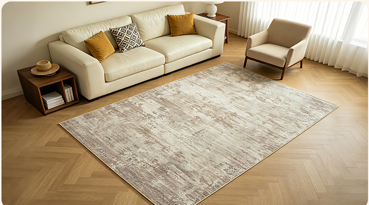
A printed velvet carpet already carries its own weight in a room, so the furniture needs to step back rather than compete. Look at the carpet's palette and pick one quiet tone—maybe a dusty rose, a deep moss, or a faded ochre—then let that color show up only in a single throw pillow or the piping on a chair cushion. If your sofa is a solid neutral that already lives in the same color family, even better; the carpet gets to be the star while the seating fades into a supporting role.
Scale matters more than most people expect. A large, loose floral or geometric print can handle a substantial sofa without feeling swallowed, but a small, dense pattern tends to argue with bulky furniture. Leave visible floor around the edges of the rug instead of anchoring every piece on top of it; that breathing room keeps the pattern from turning into visual static. If the existing furniture is mostly dark wood or matte leather, the velvet's sheen will read as intentional contrast rather than clutter.
Don't try to match every color in the carpet, and don't introduce a second loud pattern unless you are ready for a maximalist look. One small accent chair in a coordinating solid or a bench with a subtle texture can sit near the carpet without causing noise. For the rest, lean on materials that don't reflect light—linen, boucle, unfinished wood—so the velvet's pile stays the only soft, shiny surface in the room.
Underfoot texture matters more than the pattern in low light
When the light fades, your eyes stop being the primary guide. You start feeling your way forward, and the first point of contact is the sole of your shoe meeting the ground. A smooth, polished surface with an elaborate printed design might look refined in daylight, but at night it becomes a slick, unreadable plane. What actually keeps you upright is the physical grain, the slight ridges or grooves that let your foot sense a shift in balance before your brain even registers a slip.
Patterns are visual; texture is tactile. In a dim hallway or a street with broken lamps, the fanciest geometric motif on a tile means nothing if the surface is uniformly flat. Your weight shifts, your arch tenses, and what you rely on is the subtle unevenness underfoot—the same reason a concrete sidewalk with broom marks feels safer than a polished marble floor even in near darkness. It's not about seeing the texture; it's about trusting it without a second thought.
Designers often get this backwards, treating flooring as a canvas first and a contact surface second. But walk through an old stone alley in the dark and your feet will tell you exactly why centuries of foot traffic have worn those stones into a forgiving, irregular map. Texture isn't a detail you notice; it's the detail that catches you when you don't notice anything at all.
When a large-scale floral print actually calms a room down
There is a quiet paradox in oversized florals: the same boldness that can overwhelm a small swatch becomes a soothing field when given room to breathe. Think of a wall covered in sprawling peonies or wispy wildflowers rendered in muted tones—the scale pulls the eye outward, softening the edges of the room instead of demanding constant attention. The trick lies in restraint of palette; dusty blues, sage greens, or faded blush on a linen or matte ground keep the pattern from shouting, letting the repetition feel more like a gentle landscape than a graphic statement.
Unlike small, busy florals that can create visual static, a large-scale print anchors the space with a slower rhythm. The motifs are spread far enough apart that the eye rests between them, and the background becomes an active part of the calm—often a warm ivory or soft gray that reads as negative space rather than blank wall. In a bedroom or reading nook, this effect is amplified by natural light; shadows shift across the broad petals and leaves, giving the print a living, breathing quality that invites you to sit still.
Furniture choice matters here too. Pairing a dramatic floral wallpaper or curtain with solid, low-profile pieces in natural materials—oak, rattan, washed linen—keeps the room from tipping into fussiness. The floral becomes the only "loud" element, but because its scale is generous and its color story is hushed, it reads as a backdrop for comfort rather than a centerpiece for show. In the end, the calm comes not from avoiding pattern, but from choosing a pattern that knows how to exhale.
FAQ
The pile has a slight crush effect that gives the surface a soft, almost suede-like glow. Fine lines and color blends come through more crisply, and the dense weave usually feels warmer underfoot than flatwoven or thin synthetic rugs.
Stick with light or mid-tone backgrounds and smaller-scale repeats like slim geometrics, scattered botanicals, or faint damask. A large central medallion can actually work too, as long as the border stays simple and the surrounding floor isn't overcrowded with furniture.
They can, but the key is to pick a higher-density pile and a pattern that doesn't show every footprint. Darker multi-color designs tend to hide wear better. Adding a quality rug pad underneath also stops the pile from crushing too quickly.
Pull one secondary color from the carpet and repeat it in cushions, a throw, or a table runner. If your furniture already has strong patterns, choose a carpet with a quieter border or a tonal print. Otherwise, let the carpet be the main event and keep other textiles fairly neutral.
Soft sage, dusty rose, warm ivory, and slate blue feel calm but not dull. If you want more drama, deep teal or aubergine with a faint metallic thread can make the room feel intimate without making the floor look like a mirror.
Use a vacuum with the brush roll turned off or set to the lowest suction. For marks, dab gently with a cloth dampened in cool water and a tiny amount of mild dish soap. Don't scrub or soak the area, and let it air dry away from direct heat.
That usually happens when the whole surface is coated with a high-gloss finish. Better options have a matte base with only certain parts of the print catching the light. Textured designs with dense outlines also help the carpet read as plush rather than plastic.
At least three: an organic abstract, a structured geometric, and a softened traditional motif. Compare them at different times of day in your actual room, because the velvet texture can shift the way colors and outlines appear depending on the lighting.
Conclusion
Printed velvet carpets do something ordinary rugs can't: their dense pile diffuses light across the surface, so even the loudest geometric or botanical motifs settle into a softer, more inviting presence underfoot. Before you fall for a pattern, flip the rug over. A woven, non-slip backing with tight fiber anchoring is the difference between a rug that stays crisp for years and one that buckles or sheds after a season. Fading isn't random either — low-quality dyes and thin pile expose the base fabric quickly in high-traffic zones or direct sun. Crystal velvet styles that hold color well use yarn-dyed fibers and a pile height dense enough to protect the base, which means the print stays legible without turning muddy.
Bringing a printed velvet carpet into an already furnished room doesn't have to feel overwhelming. Let the rug's largest color echo a secondary tone in your sofa or curtains, and keep the surrounding textiles mostly solid so the print reads as intentional rather than chaotic. In dimmer spaces, what your feet notice first is texture, not pattern — a plush, even pile with subtle sheen can anchor a room even when you can't fully see the motif. Interestingly, oversized florals or sprawling abstract prints often quiet a space more than tiny repetitive designs, because the eye finds one continuous gesture instead of many competing dots. The best crystal velvet picks combine that calming scale with a pile that feels as good as it looks, making the floor a foundation rather than an afterthought.
Contact Us
Contact Person: Ivy Yin
Email: [email protected]
Tel/WhatsApp: +86 18519681805
Website: https://www.sensecomarketing.com/